Clue: Marketing
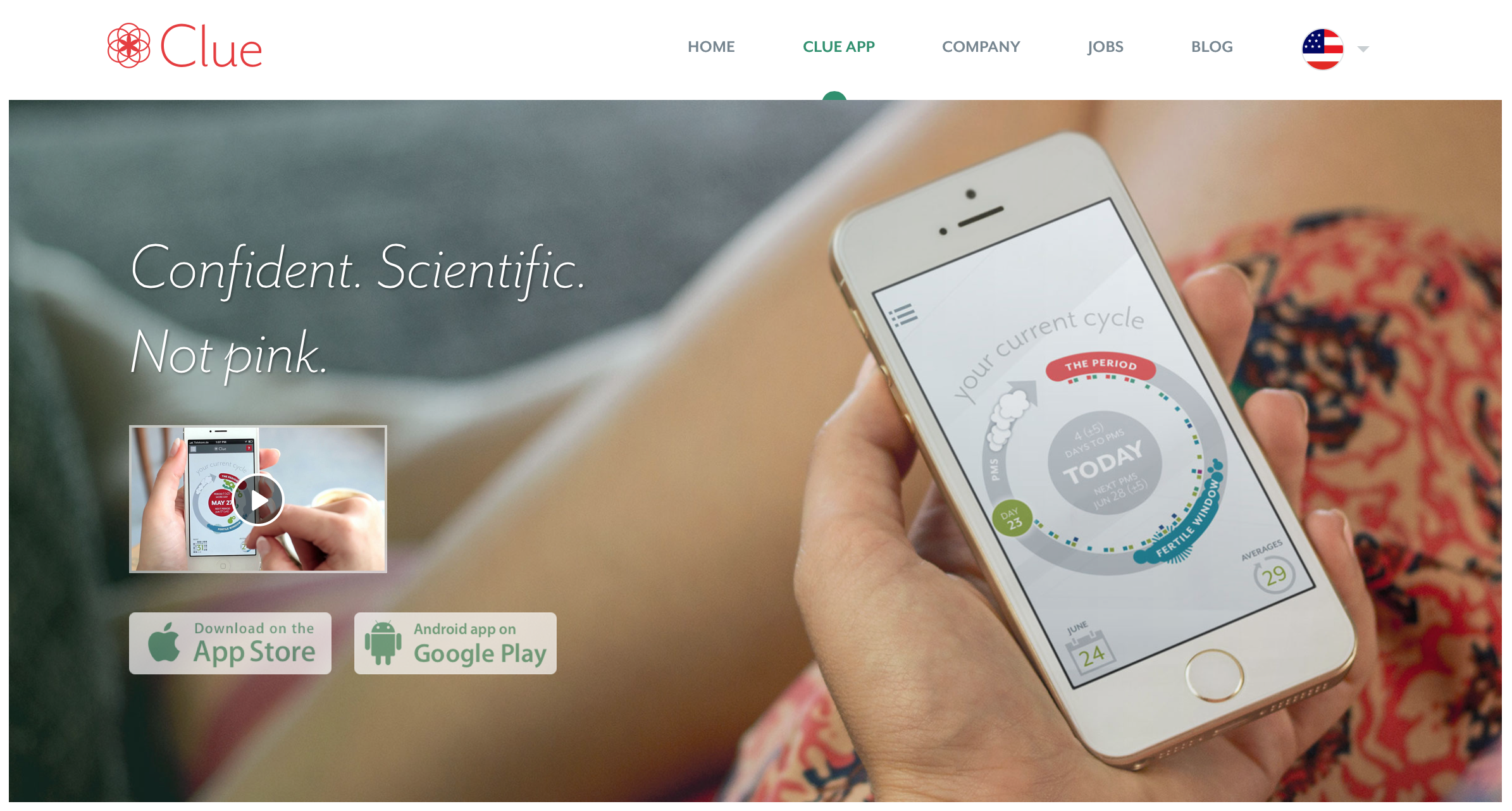
Clue is a cycle-tracking mobile app for iOS and Android. Its marketing looks like this:

Why “not pink?” Because most women’s apps are – and that’s sometimes a sticking point. Numerous female friends and colleagues have spoken with me about how they don’t want butterflies, magenta, or script typefaces.
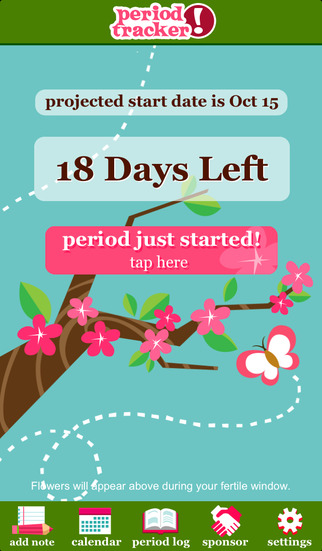
Contrast Clue’s depicted screenshot with this competitor:

Interaction model aside, just looking at the graphic design, which would you rather use? 7.1 and 7.4 of Cadence & Slang instruct you to account for a variety of perspectives and customs when putting together your application, and the more neutral you can make something, the more likely it is to speak to a broad array of people.
Because some people might like pink on their application, but others may not. You could argue that pink is a business decision to make the software more “opinionated,” but software’s opinions should be expressed in terms of the interaction model, not the graphic design. And alienating people isn’t good business.
Takeaways
- Account for the plurality of your audience. If you’re making a period tracker, you’re making it for most women. They have a wide range of expectations and norms. Lest you think going general is hard, most big tech companies manage to do it successfully. Why not you?
- Do research. I’m a dude, but I found this all out by asking questions, shutting up, and listening for a few hours. Surely the opinions of my friends and colleagues aren’t an isolated one-off. And if they are, you can always discover that with more research.
For more on these principles, read Cadence & Slang today.