SigFig: High-Touch Outreach
SigFig monitors your investments and provides insights on your whole portfolio. This makes it sound like another boring financial app with terrible UX, but SigFig does many things right – in the field of information display, of course, as well as its overall interaction design.
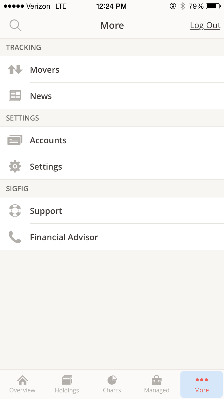
One especially interesting design detail occurs deep in the “More” menu, under “Financial Advisor:”

A real person appears with a photo, name, biography, and personal details – with the option to call him immediately.

What would you have expected in this scenario? In my own experience, tapping something like “Financial Advisor” would yield a faceless, nameless form field – or an email address for me to pose my query. Hiring real people and putting them front-and-center is a bold move for SigFig – and it fits section 1.11.2 of Cadence & Slang handsomely, telling you to underpromise and overdeliver.
Here, 4.1 (to understand your customers’ expectations) and 4.1.4 (to know what your customers expect in a given context) are met as well – and I suspect that this acts as an interesting talking point for SigFig’s customers and press.
Takeaways
- Go above and beyond expectations when you can. In an industry like financial management, the rewards are potentially quite high while delighting your customers at the same time.
- Provide a human face on your services. We all deal with so much byzantine insanity in our own lives that finding a real person is always refreshing. This is the equivalent of your calling the electric company, and a real human picks up and asks how you’re doing.
- Always provide a clear next step. It’s great that I’ve met my financial advisor – and it’s made clear that their next step is for me to call my financial advisor. So not only is the interface going above and beyond, but it’s also providing an easy way for me to seize the opportunity.
For more on these principles, read Cadence & Slang today.