Dollar a Day: Authentication
Dollar a Day is a monthly service that catalyzes group charitable giving. By donating $31.40 a month apiece (to cover credit card processing fees), 920 people (as of this writing) donate a dollar apiece to different charities. It’s easy to see how this adds up: if all 920 people continue donating in this way, that adds up to over $330,000 every year.
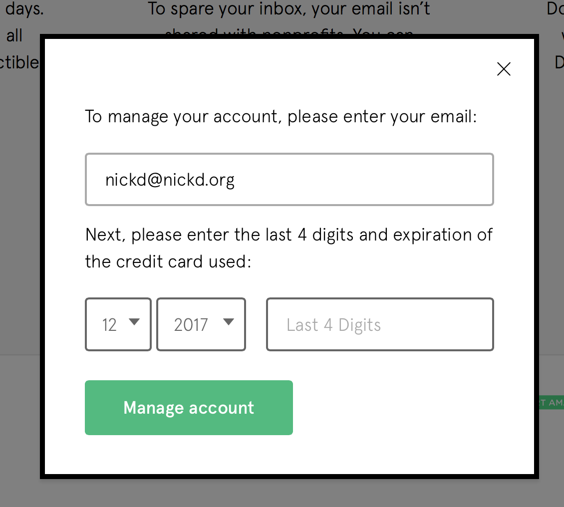
Draft signed up for Dollar a Day on its launch earlier this year, and when I signed back in to maintain my account, I was presented with this interesting dialog box:

You authenticate with your credit card information, not a password. In fact, you don’t have a password at all.
On the one hand, passwords are a subpar system for security, with numerous alternatives (swiping patterns, Touch ID, and two-factor authentication) slowly taking their place.
On the other hand, do you really have only one credit or debit card? (Between Draft and my personal accounts, I have ten and carry four – and I suspect that’s on the low end, compared to some folks reading this.) When I type in valid information for one of my different cards, I’m presented with the error message “We couldn’t verify this account. Please check your info.”
2.3.6 of Cadence & Slang tells you to make your error messages descriptive; towards that end, this particular error could ask someone to check whether they have multiple credit cards, and perhaps even to check their latest statements to ensure they’re entering the right one. Yet 5.2 also tells you to take care in determining the right defaults – and omitting a password entirely is a great way of setting positive, comparatively frustration-free expectations around one’s use of the product.
Finally, 5.7 tells you to require only essential information when signing people up – and is a password truly essential for many services? For something as low-risk and simple as Dollar a Day, it’s highly unlikely that adding a required password would benefit either Dollar a Day or any of its customers.
Perhaps the increased amount of customer service is worth it for Dollar a Day, relative to the amount of people who would forget their passwords or provide insecure ones that they use on dozens of other sites. This is a great example of a design decision providing tradeoffs for everyone – and, as usual, there are no easy answers.
Takeaways
- In passwords as in the rest of your interface, do what’s familiar. This works because people know how to enter their billing information. If you make people authenticate in particularly unconventional ways, they’re less likely to understand what you’re expecting of them.
- When authenticating your customers, make sure you account for the possibility of error. It might be less likely that people input an erroneous credit card than an erroneous password – made even more likely if you do the right thing and use different passwords for different services.
- Only require information if it makes sense to do so. Things you may come to expect, like an email address or password, may not make sense for your product – and great products put in the work to re-ask basic questions of what they offer.
For more on these principles, read Cadence & Slang today.