American Express: Web Payment
American Express recently announced a staggered rollout of a new design, and the first thing to see an update is the way you pay off your credit card:
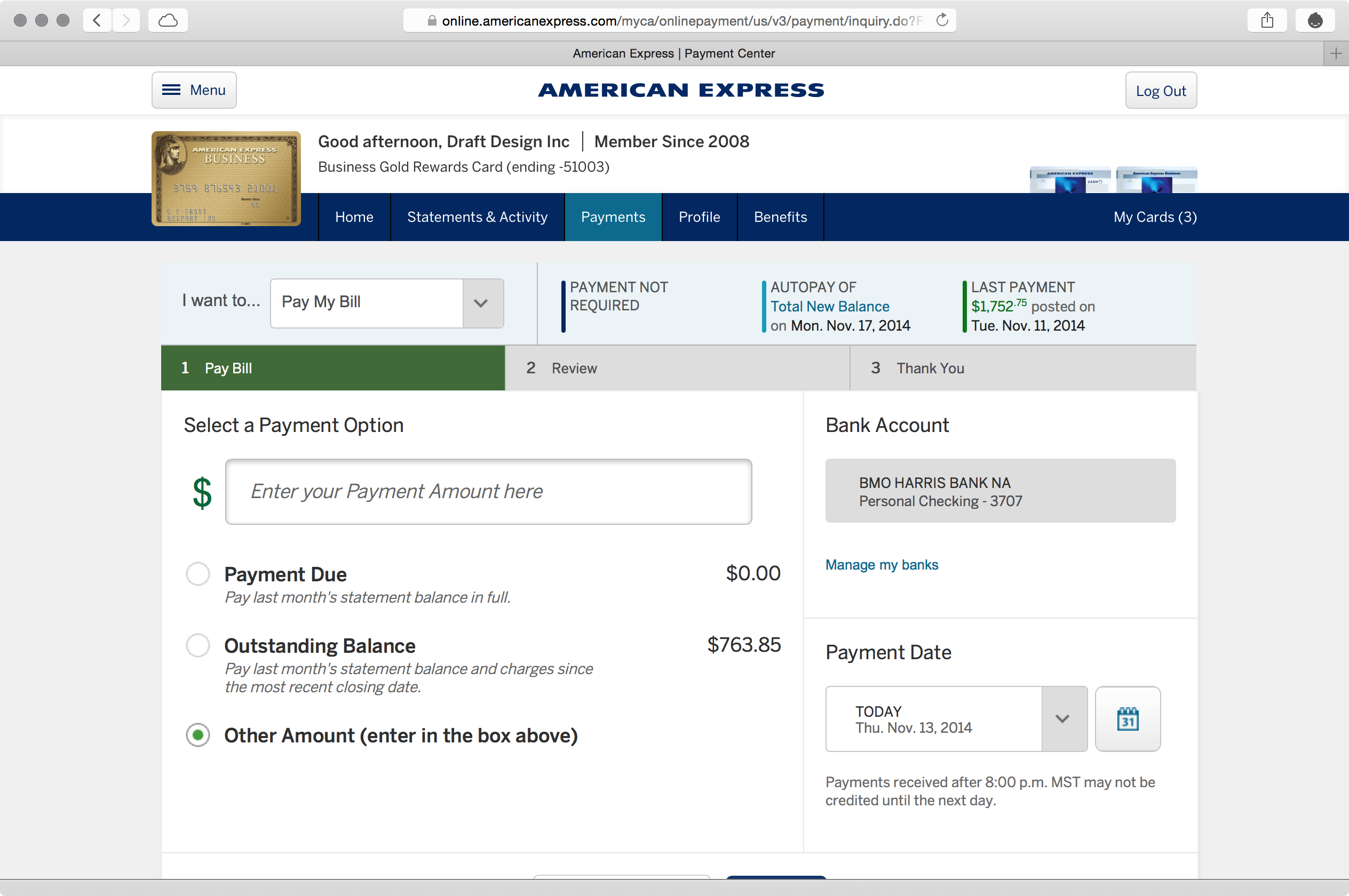
With an enlarged and foregrounded image of your card, it’s clear which one you’re paying off. But with the backgrounded alternate cards, it’s hard to select the right one – especially in a product line like American Express’s, where many of the cards look similar, especially among business and personal.
It’s also clear how much you’re paying. If you select a radio button to pay your card in full, the prominent dialog box updates accordingly. On charge cards like American Express’s, where you are more liable to pay the whole thing off at once, making the status of your card less prominent makes a little more sense.
2.1 of Cadence & Slang suggests you build a consistent hierarchy, which is good here. And 2.4 proposes a consistent visual language, which has been cleaned up significantly in this redesign. But the hierarchy also needs to be clear and understandable, and – as it stands right now – could use some rework.
How do you confirm your payment? The button is near-wholesale cropped in a maximized Safari window on Yosemite, on a 13” Retina MacBook Pro.
This is not exactly an uncommon browser size. And it’s doubly forgivable with a prominent sidebar (where you could easily move the confirmation button) and a generously tall header that shows two levels of navigation.
The submit button is similarly cropped on the confirmation screen:
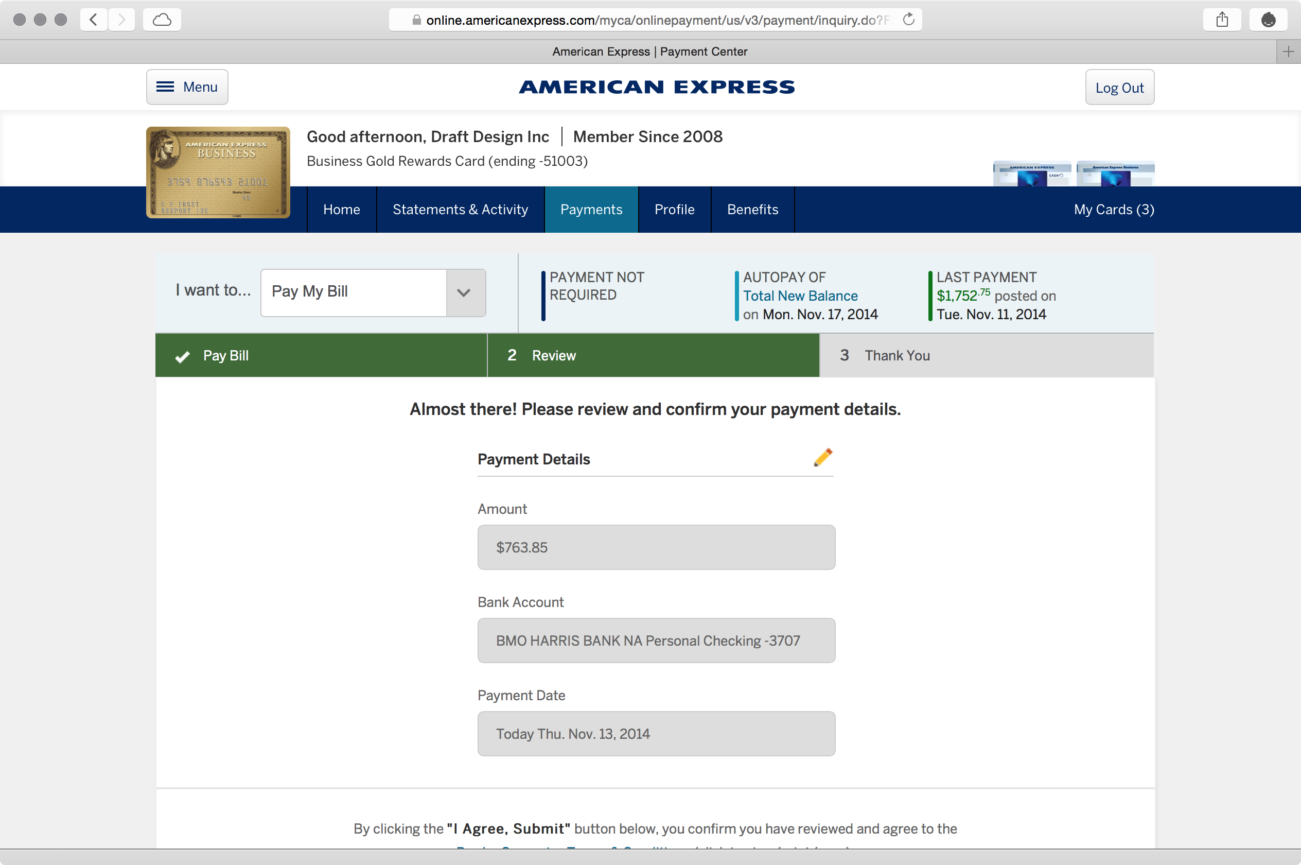
In one way, the hidden button is an interface problem because it isn’t made immediately apparent. But a second problem exists, too: you have to scroll down, which requires an additional step in your interaction. 2.2 asks you to remove the number of steps possible to complete a task, especially common tasks – and paying off one’s credit card is arguably the most common task they’ll perform on an issuer’s site.
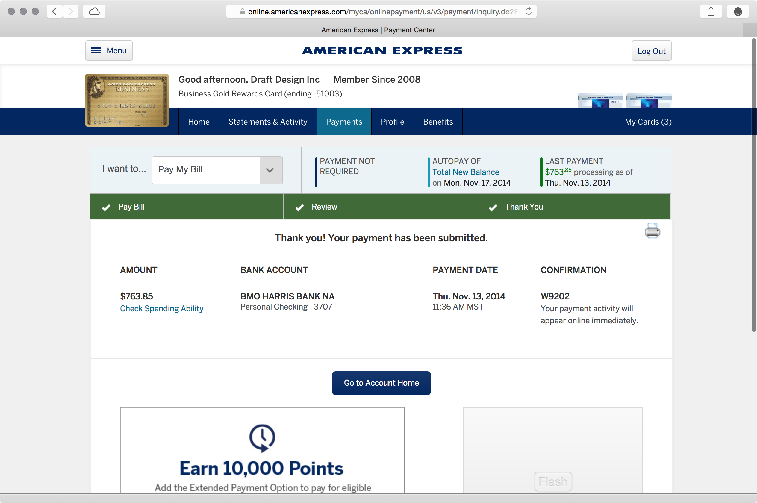
Mercifully, the confirmation button reveals itself once you’ve already paid:
Takeaways
- Establish a hierarchy, but make it easy to understand. Don’t shrink elements to the point of illegibility, and make it clear what is pliant and what isn’t.
- Don’t hide frequent tasks’ critical elements on common devices. Rather, place them in the most prominent area so they are impossible to miss.
- Condense your header so it stays out of the way. Your header shouldn’t be two-fifths of a maximized laptop browser’s screen.
- Don’t create two layers of navigation with two different interaction models. Here, a series of pull-down menus and an oft-used-on-mobile hamburger button define two different navigational models with two different layouts. On a site like American Express’s, these two menus should be consolidated into one consistent hierarchy.
For more on these principles, read Cadence & Slang today.