iTunes 12: Batch Editing
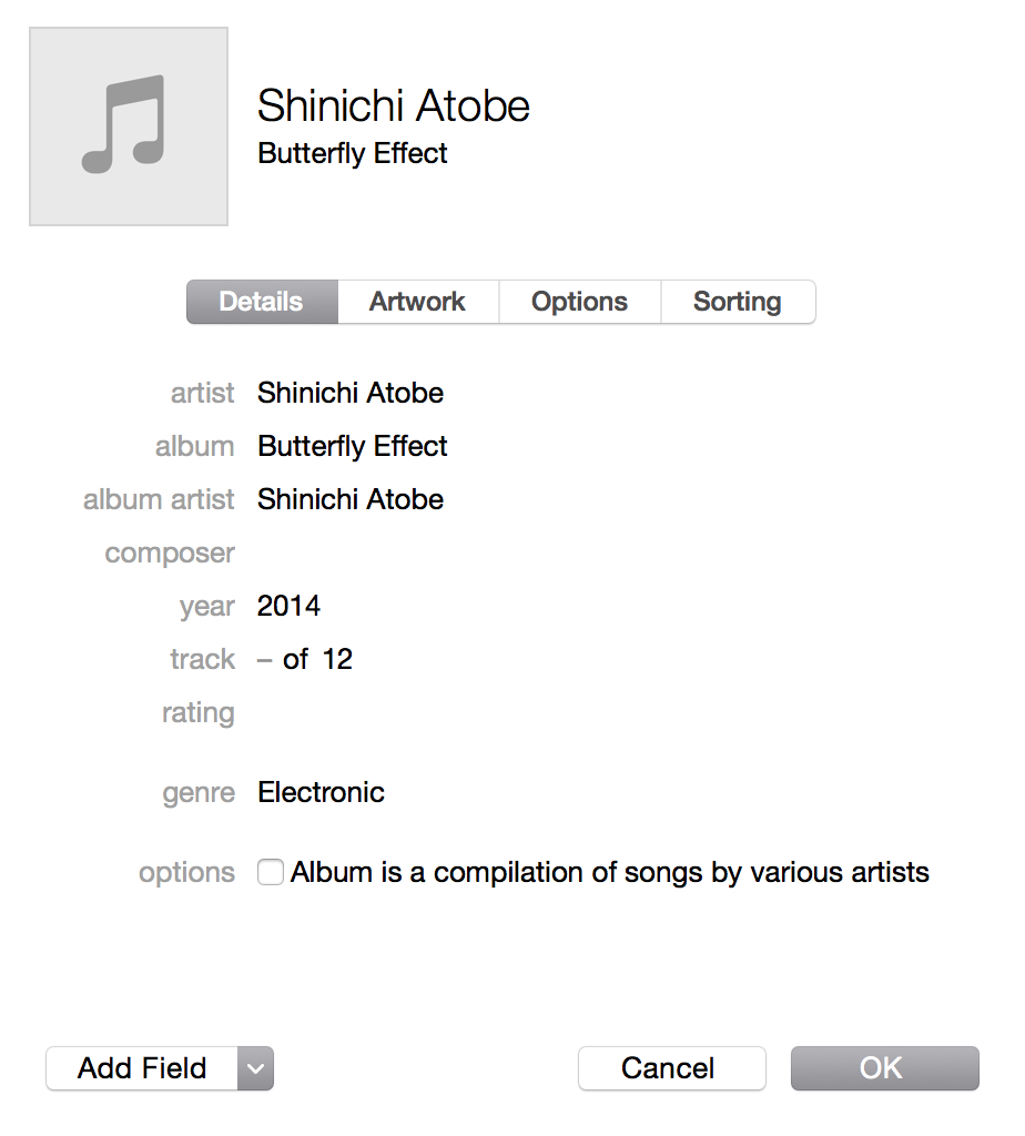
The latest iTunes has been released with Mac OS X Yosemite, and it contains significant reworks to its interface as per usual. One interesting redesign is in its batch editing, reworked for the first time in years. Editing multiple tracks shows the following layout:

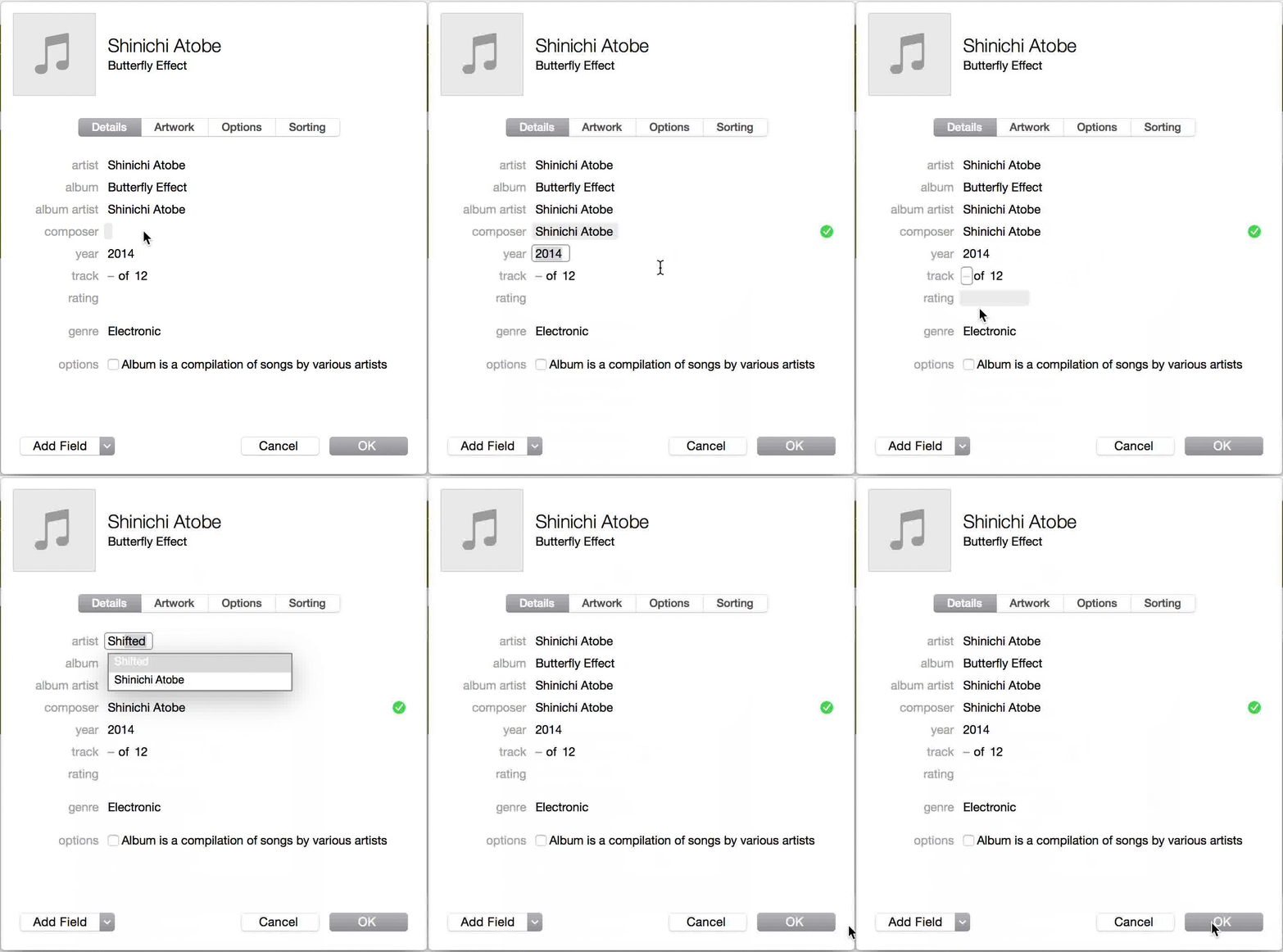
Are these elements editable? Yes, if you click one of them and type something different:

Here are some more properties of this dialog:
- Text fields don’t appear editable. 1.10.5 of Cadence & Slang indicates the initial state of an interface should invite use – but nothing looks clickable here other than the “OK” and “Cancel” buttons, the navigation tabs at the top, the pull-down to add a field, and the lone check box under “options” (sic). Clickability should be apparent for other fields – and the rest of Yosemite appears to bear this out, from Safari to Spotlight to in-app search fields.
- Hovering makes editability apparent. Doing so provides a gray background; clicking makes the input area look like a text field. But editable fields should appear editable, as this makes the interface easier to immediately understand, and for novices to learn faster.
- Making a change provides a green check mark – but no changes are made until you hit “OK”. A green check mark is supposed to indicate confirmation that an action has already occurred.
- Changing a field to the same value does not provide a green check mark, which is a good behavior to provide in case you made an error.
According to 2.2 of Cadence & Slang, all products should have a consistent behavioral language, and this particular dialog in iTunes goes against Yosemite’s conventions with no immediately apparent reason for doing so.
Takeaways
- Pliant elements should look pliant. If I can click it, a border should exist that indicates that it’s clickable. This already exists in iOS 7 and 8’s accessibility settings, but it should be the default for everyone, across both iOS and Mac OS X.
- Hovering is insufficient for implying how an interface should be used. An interface should be learnable by looking, not by using. If you have to explore an interface to know how to use it, the interface failed to do its job.
- Confirmation shouldn’t happen until an action has been taken. Otherwise, the next step is ambiguous. Should you hit Cancel or OK once you’ve made a change? Is it possible to undo this change? How?
For more on these principles, read Cadence & Slang today.