Clear: iOS Interaction Model
Much has been written about to-do app Clear’s interaction model on iOS, as it’s predominantly gesture-based; without any significant visual cues beyond the lists themselves, both navigation and editing are only discoverable after use or tutorial.
Put another way, the interface does not make its own use obvious. You have to play with it to understand how it works. Tapping negative space can trigger unexpected actions; there is no wayfinding interface on the resting state of any screen, short a list of lists and an overall menu; two-finger pinches and swipes are hard to learn without hand-holding.
In short, rule 6.1.1 of Cadence & Slang – which tells you to make your interface immediately understandable and learnable on its own – is broken all over the place. Yet Clear succeeds as a useful tool, with (according to its own marketing) over two million happy customers. How is 6.1.1 broken well? What can this teach us about how to break other rules?
Making Clear learnable
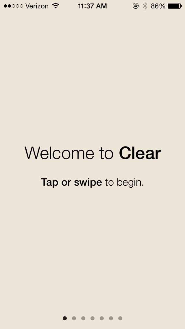
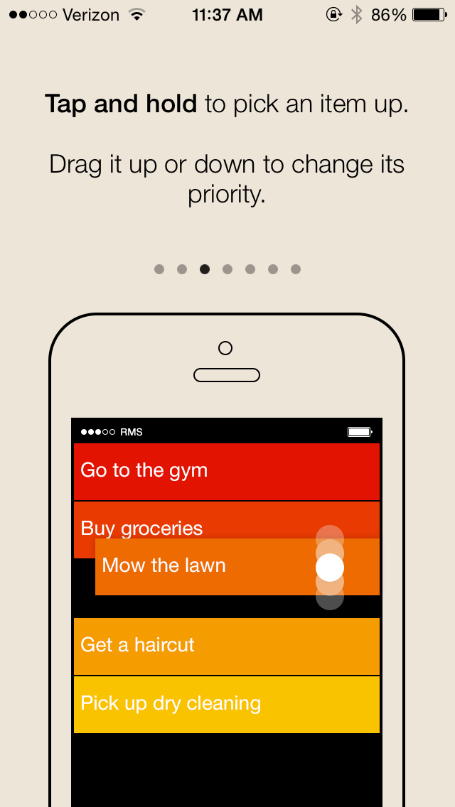
Learnability is paramount in new interfaces, so Clear’s tutorial is the most important way to get people interested in using the app with minimal frustration. Clear does this handsomely, teaching people how to use the app on first run:
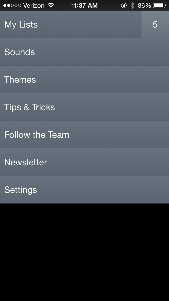
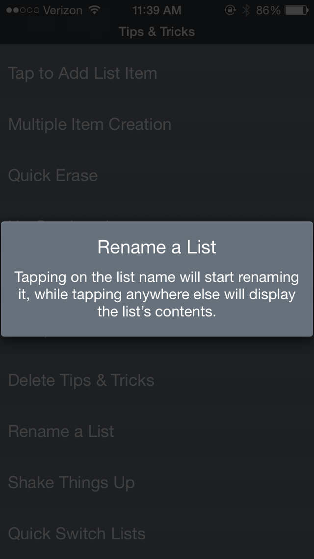
Once you’ve gone through this tutorial, it’s accessible at any time from Clear’s own dedicated “Tips & Tricks” section:
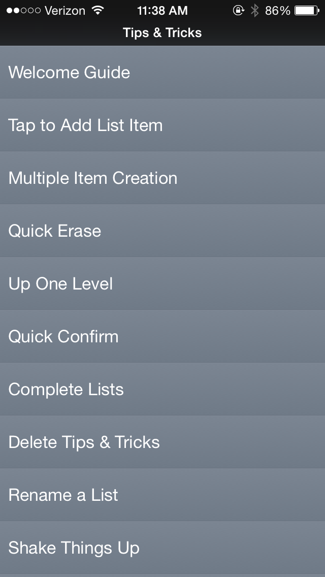
Finally, that section contains a lot more than just the first-run tutorial, showing its depth and power – if you ever want to take advantage of it, of course:
Rule 2.5 of Cadence & Slang suggests that you make your interface learnable without coddling. Clear does this well, by making the interface geared towards quick interactions by someone who wants to use it as a daily tool. In this way, it targets people of intermediate experience levels, and trains them to become experts.
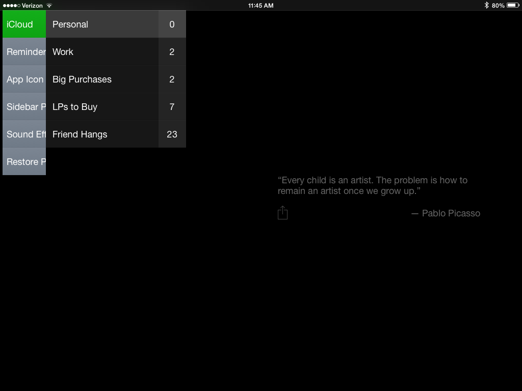
Items in the middle of a list
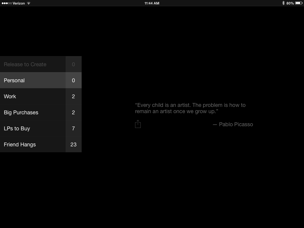
How do you create items in the middle of a list? On the iPhone version of Clear, a two-finger pinch provides a new item anywhere you want on a list. Yet on the iPad, this is not allowed for either lists or items; you have to create a new item at the top or bottom of a list, and then drag it into position.
Both 2.2 and 2.6 call for consistency between platforms – and if you’re developing a universal app for iPad and iPhone, it’s reasonable to expect a similar interaction model for each device.
Update: Clear says this works on iPad – although the other inconsistencies still hold.
Finding the menu on iPad
On Clear for iPhone, one navigates by tapping items to move forward, and swiping down from the top of the screen to move backward:
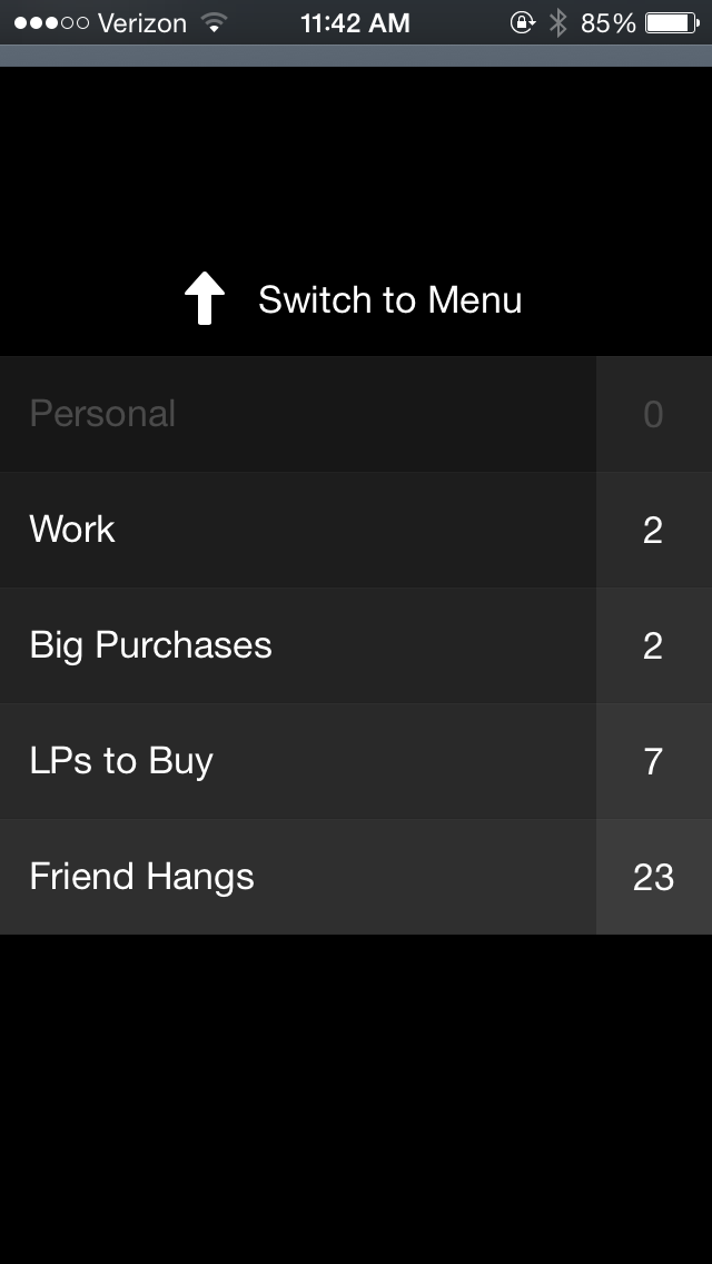
Yet on Clear for iPad, this isn’t how you get to the menu. Lists and items are on one screen, and swiping down simply creates a new list, no matter how far you swipe.
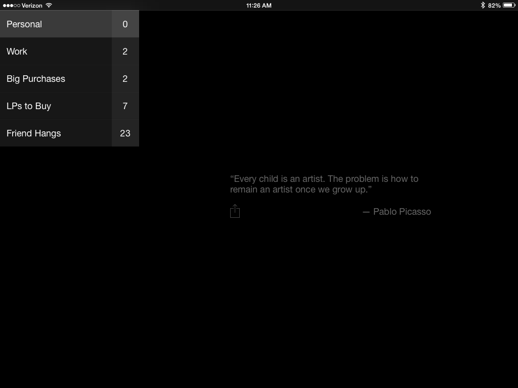
How do you get to the menu? By swiping right, from the edge of your screen:
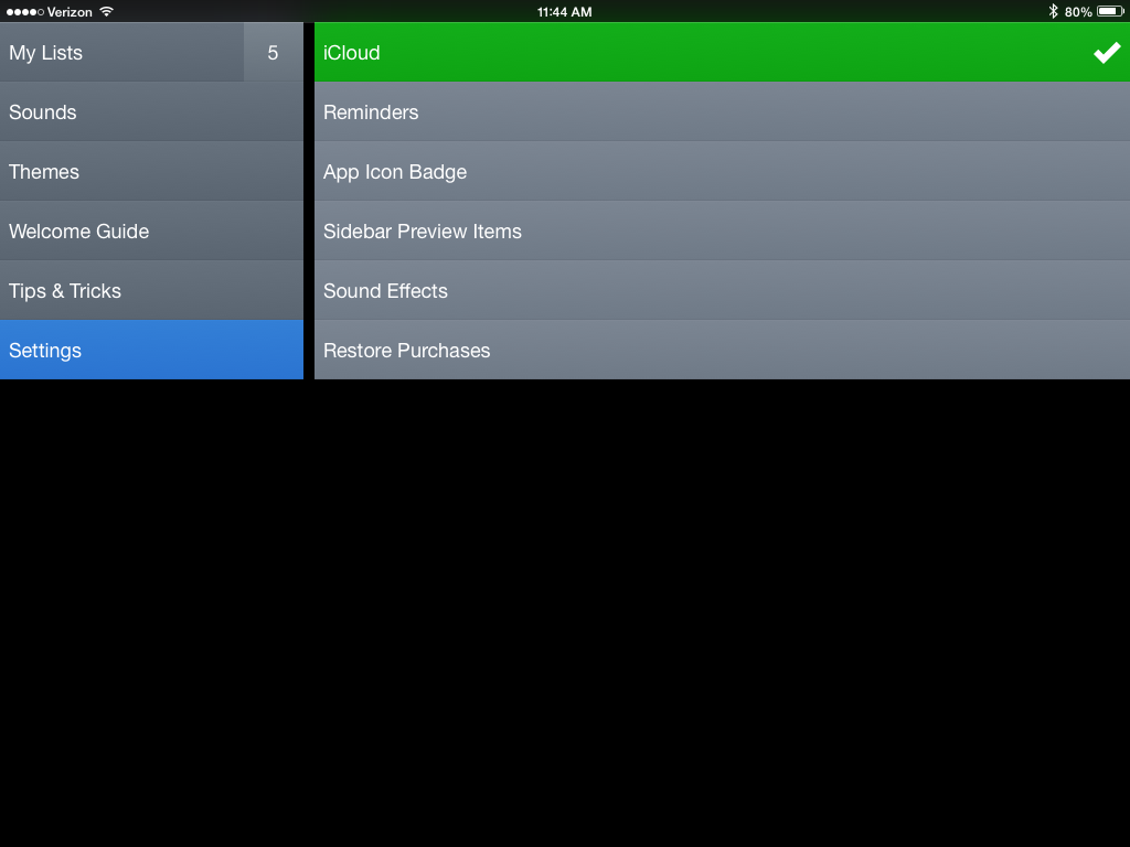
On the one hand, this interaction makes sense for iPad. It fits the form of the the device itself, and it fits the way Clear has chosen to lay its primary interface out. At the same time, this is inconsistent from the way Clear works on iPhone – and it’s nigh-undiscoverable, considering all of the tutorials are only accessible by side-swiping to the main menu. If you don’t know this gesture – or you skip the upfront tutorial – you have to consult Google to figure out how to change my settings on Clear for iPad.
Takeaways
- It’s fine to change your interaction model to fit the needs of a new device, but you should take caution in enforcing consistency between platforms.
- You can make an interface that’s hard to parse on its own, if and only if you make teaching it a priority and there’s a clear reason for targeting more experienced people.
- First-run tooltips should be accessible at any time, but you should probably keep them away from the primary interaction.
For more on these principles, read Cadence & Slang today.