Slack: Preferences
Slack is a cross-platform chat tool with an interesting backstory and the best interface going right now.
Slack is a B2B tool that actually manages to be whimsical and fun – while garnering numerous large enterprise customers. This is a fine line to walk, but they appear to have succeeded at it for now.
There are a lot of details to discuss in Slack, but I’ll focus on its preferences today, which are but a small component of the overall package.
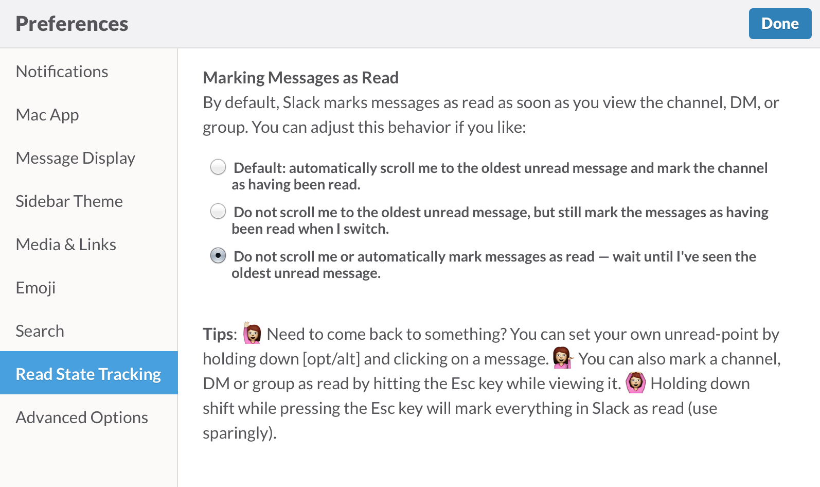
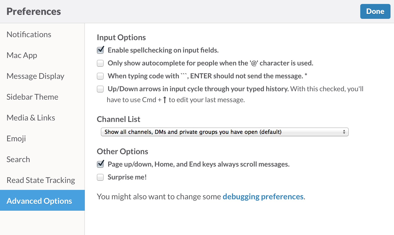
Slack’s preferences are more robust than most chat applications, indicating that they are catering directly to businesses who want fine-grained customization of each setting. 5.9 of Cadence & Slang tells you to use use preferences where appropriate, and goes into some examples.
In particular, the book recommends you be less conservative with preferences when your product targets experts. If your customers are going to be using Slack all day, every day, for their jobs, within enough time they’ll become good at using it.
Tips are delineated with emoji:

They could have written about these blandly, but their decision not to do that added a lot of helpful personality. (And I’m sure these tips would have come off differently if they had used 💇, 🙅, or 💆.) Finally, the last preference screen has a check box labeled “Surprise me!”:

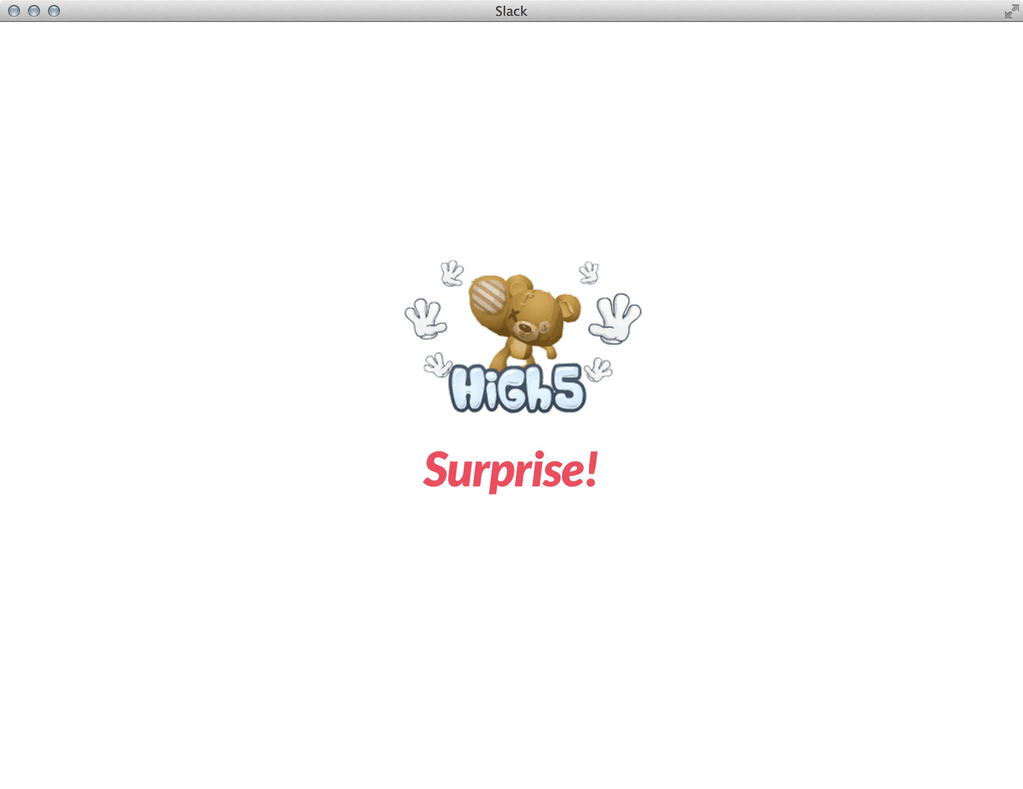
Checking it fades the screen to white and provides a little gif:

I laughed so hard when I first checked this that I did it twice more – and then showed my partner, who demanded that she be given a copy of Slack to use on her own.
4.3.2 and 4.3.3 both come into play here: this interaction is both completely unnecessary and full of joy and wonder. The former is easy to pull off; just add a check box that doesn’t do much of anything. The latter is much harder, and would probably require a lengthy digression on what makes something funny. Both together are harder still to pull off.
Takeaways
- There’s no one right way to do preferences, and it’s largely contingent on the type of product you’re making and the audience you’re making it for.
- Add personality in small, subtle ways – through GIFs and emoji – that make using technology fun, no matter how business-critical it may be.
- Adding small, unnecessary, joyous interactions provides a lot of personality to your product. And in a world that can feel quite sterile and clinically rigid most of the time, that goes a long way towards establishing a sense of camaraderie with your customers.
For more on these principles, read Cadence & Slang today.