Simple: iOS Redesign
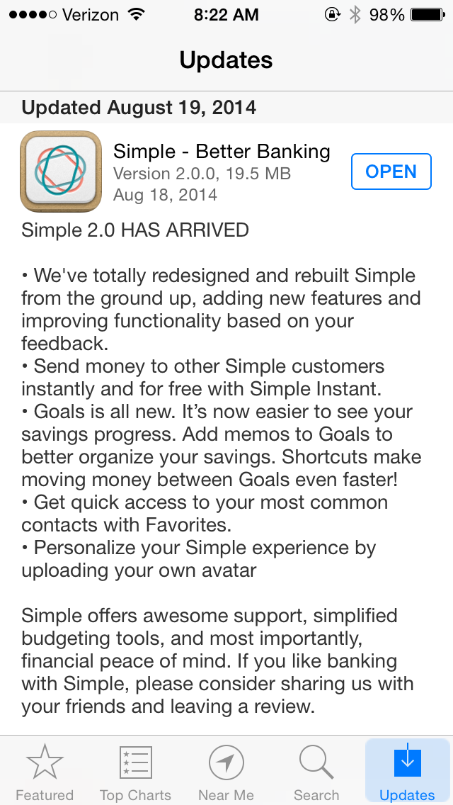
Internet bank Simple redesigned their iOS app for iOS 7 recently. When updating, their redesigned icon curiously didn’t show up:
But that hardly mattered, as the new interface adds features without cluttering itself: a tall order for many mobile applications. The unlock screen looks nice, although it could use stronger feedback when indicating which key has been pressed:
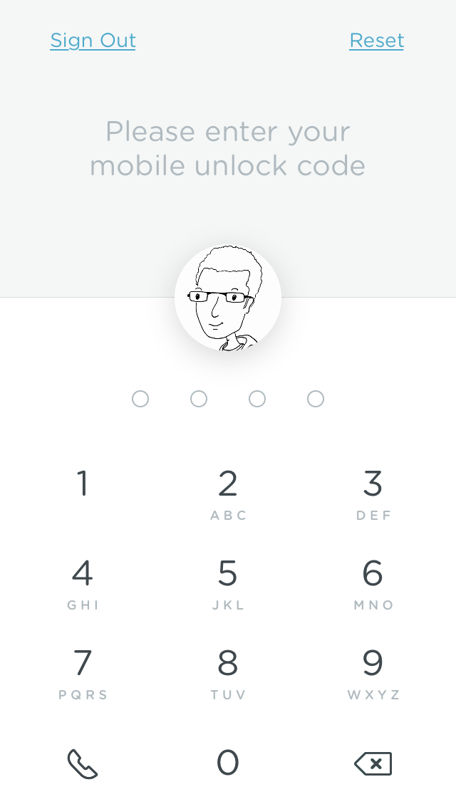
While key presses may be hidden for security reasons, this lack of feedback may confuse people and increase the rate of incorrect entry. 2.3.6 of Cadence & Slang tells us that feedback should be consistent, and 2.8 tells us that the resident OS should prescribe the norms of the app. When entering a PIN, then, iOS already tells us how to proceed – with its standard lock screen.
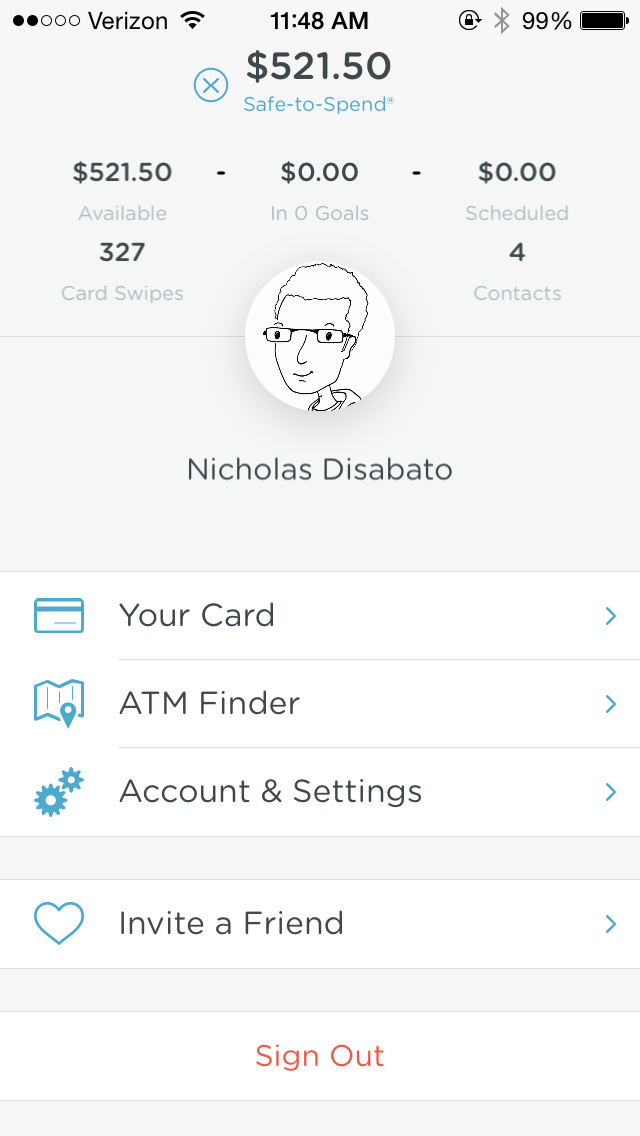
The home screen is a formidable upgrade from the previous design:

Starting in iOS 7, a restricted color palette has governed many app designs, and Simple’s is no exception. While 3.4 advocates for a muted, quiet color palette, Simple’s alert and error messages act as the most prominent and contrasty elements on the screen, as seen above and in the following:
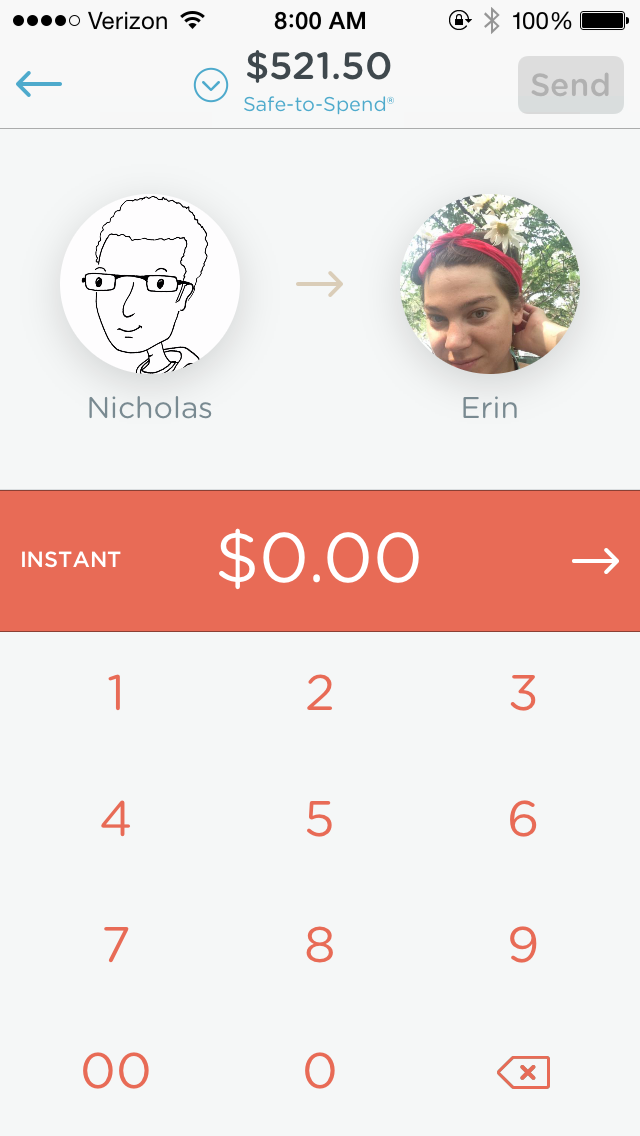
Moreover, the use of red in keypad text (inconsistent with the PIN entry above) and the final total promotes a sense of discomfort – is this transfer in error? Am I losing money, or just giving it to another person? The connotation of money transfers is called into question. A green, blue, gray, or even light yellow background would be more suitable here – with black numbers on the keypad.
Red background works best for errors:
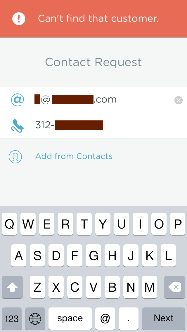
Although this error in particular could have been avoided. Adding contacts requires two methods of authentication, but both are required to be correct (violating 4.2.4).
What if my friend has a regular number and a Google Voice number? What if my friend has several email addresses, as seen here? It’s easy to get initial entry wrong.
Is the email right? The phone number? Neither? The error message doesn’t quite fit the feedback required to correct the error, violating 2.3.2 (and, to a lesser extent, 2.3.6).
Most other screens look great, with only tiny interface problems. The “Safe-to-Spend” calculation is sensible, but the dashes that offset each dollar amount are a little narrow, and could be misinterpreted as mid-dots:
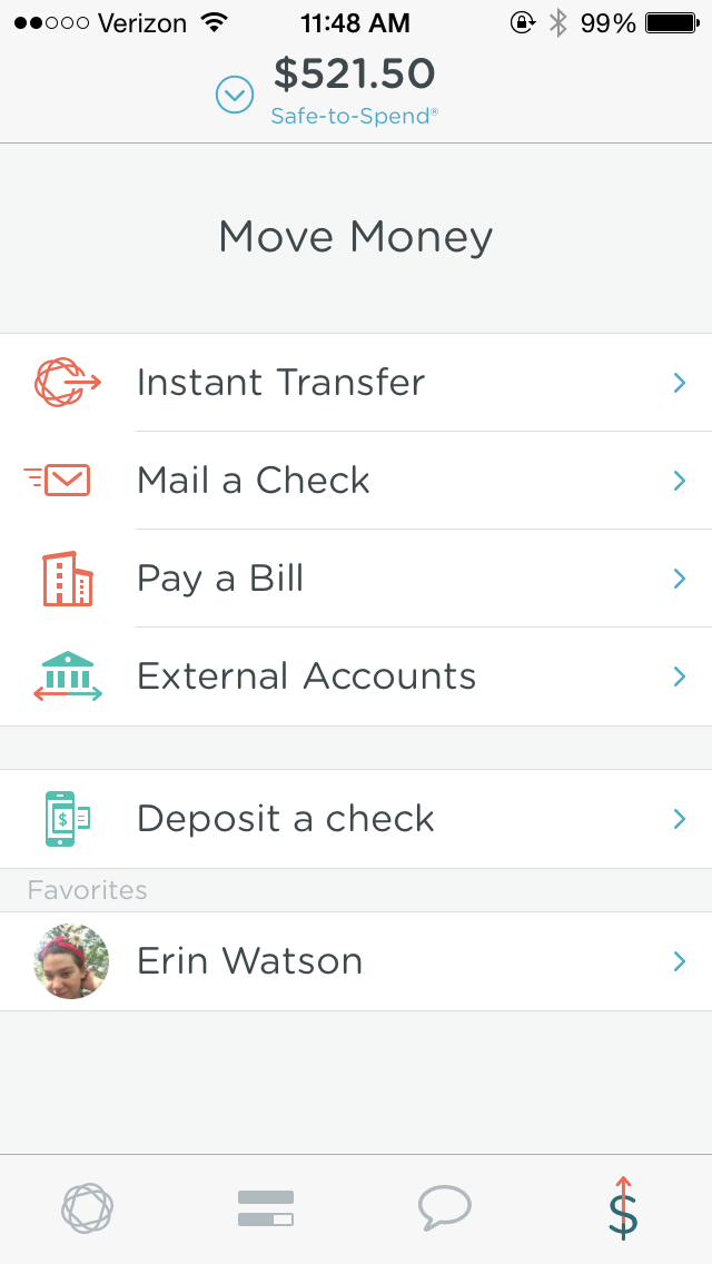
The screen you use to transfer money is clear and legible, with the flexibility to customize it for different bank accounts and favorite contacts:
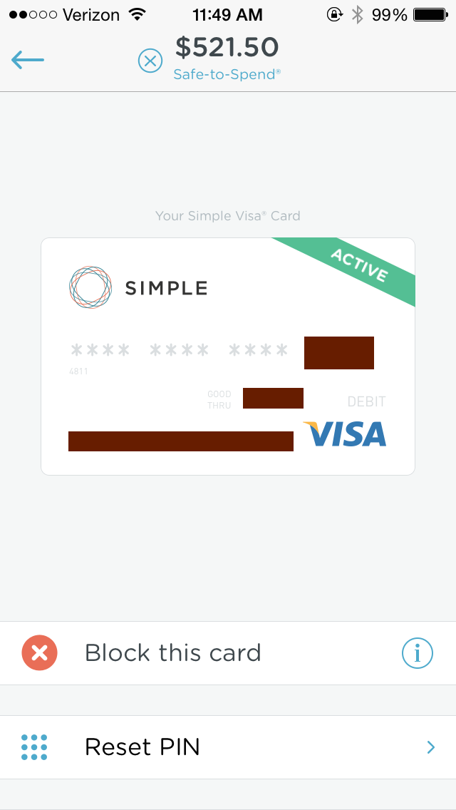
And the screen to view your card is just brilliant, with the card itself displayed clearly, and the ability to reset your ATM PIN directly within the app, set up in real time:
Simple’s new app feels rather the same as the old on first look, but small improvements have occurred throughout, and customers are all the better off for it.
Takeaways
- Removing interface chrome frequently results in a cleaner and clearer experience, even when the features are largely the same.
- Restricted color palettes are useful in “flat” designs, but make sure you have enough colors to express error, confirmation, and neutral states of the application.
- Use red shades to express errors, and orange and yellow to express alerts.
- Error messages should precisely describe the error being committed, and they should provide a precise step to correct the error.
For more on these principles, read Cadence & Slang today.